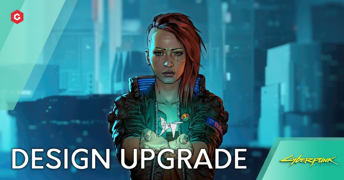
Recently developers at CD Projekt stated that they believe the enhancements in design for Cyberpunk 2077 are similar to that of The Witcher 2 to The Witcher 3, which is no small feat.
Keep reading below to find out all about it!
Recently podcasts featuring developers of the game were produced by the German site GameStar.
Reddit user Moraez went through them and translated the keys points, then compiled all the information into a post, see here.
Read More: Cyberpunk 2077 Pre-Order Guide: Price, Collector's Edition, Bonus Content And Early Access
Design Upgrade
“Developers said that the improvements in the level Design are as big as they were from Witcher 2 to the Witcher 3” says Moraez.
We saw a huge jump in terms of design and structure from the Witcher 2 to 3.
The game was smoother and overall more enjoyable in terms of player experience
Map Exploration
It seems that they intend to limit the number of map icons needed to be discovered before a player can complete an area of the map.
Previously players had to reach icons which had a minor impact on the game.
This caused map completion to become a bit of a grind.
NPC Functions
The devs also plan to give NPCs more of a routine to improve immersion.
Games like Skyrim have been praised for their NPC's program, making the player feel that they are a part of a real world.
Melee Fighting Improvement
They felt that the melee fighting system showcased in the E3 trailer wasn’t up to scratch and plan to improve it.
Explore new topics and discover content that's right for you!
Cyberpunk 2077


