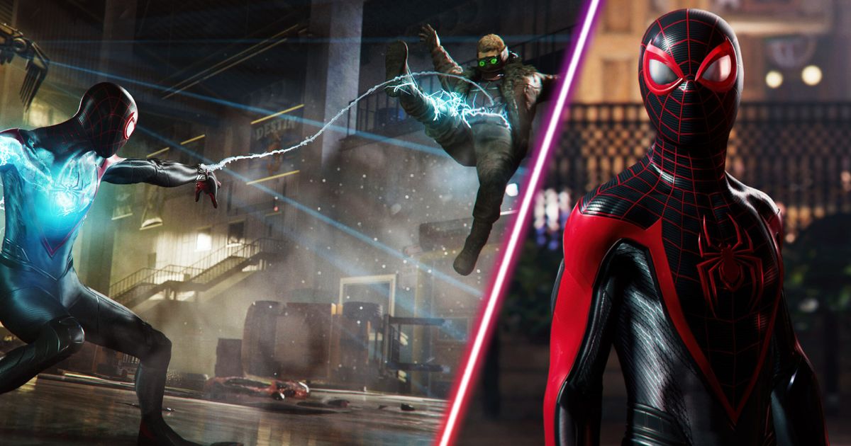
The big finale to Wednesday's PlayStation Showcase was a real treat for fans of superhero games, with a lengthy look at Marvel’s Spider Man 2 offering both introductions to its colourful cast of characters and a preview of what it’ll be like from a gameplay perspective.
If you were one of the massive Marvel fans who’d spent the entire broadcast, which also featured the likes of Final Fantasy 16, Metal Gear Solid: Snake Eater and the controversially digital-only Alan Wake 2, waiting to catch a glimpse of Spidey, odds are you’ve already combed through the Spider-Man part of the show several times.
That’s certainly what fans on Reddit have been doing and while some have been discussing the possibility of Miles having to take on Symbiote Peter Parker in a boss battle, others are caught up in a debate about aesthetics of the HUD shown in the reveal’s gameplay sections.
What did you think of the HUD shown during the gameplay reveal of Marvel’s Spider-Man 2?
Their visual-focused views can be found in a recent thread on the subreddit r/SpidermanPS4, which user 4typical kicked off by posting a shot from the reveal of the UI when playing as Parker, which you can check out below, claiming: “I see a lot of people on Twitter saying that the HUD feels 'cluttered', 'ugly' and 'out of place' in this game. What do you all think?”
A surprising number of their fellow Marvel buffs seemed to agree with the idea of the display being a bit too busy, with user BlazeOfGlory72 arguing: “It is pretty cluttered. Like, why is the web ammo a completely separate bar on top right? Why not just have it under the health bar on the top left? Also, whatever that thing is in the bottom left, move it further to the left.”
Some put their feelings down to a simple preference of the design featured in the first Marvel’s Spider-Man game, with user KonahrikwithaK musing: “I prefer the OG hud's minimalistic technical design. It worked with the idea of you seeing [displays on the inside of the] suit, not just [having] a video game HUD.”
On the other hand, a few would-be superheroes outright dismissed the idea that there are any issues with the layout, such as user TonyStark1840, who asked: “How is that even considered cluttered?” and RealEdwardNigma, who argued: “You get all the info you need, without it taking up too much screen space.”
Meanwhile, a couple of those responding to 4typical’s question got caught up in a debate as to whether it’s prudent to critique the UI shown off in pre-release material, with user Legitimate-Bowl2815 declaring: “I think the game isn’t finished, context matters, and people should just chill out.”
Regardless of what you’re hoping Marvel’s Spider-Man 2’s HUD will look like by the time the game arrives, make sure to follow us for updates on it and the other games shown off and announced during the PlayStation broadcast.
Explore new topics and discover content that's right for you!


